Discover a Captivating Visual Journey
This section presents a thoughtfully curated portfolio blending evocative illustrations with thematically chosen music to deepen your emotional connection.
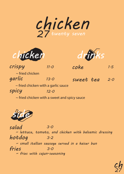
“The core identity of this project stems from a visual collaboration between the Korean word for chicken and its linguistic symbols. I focused on the Korean double consonant ‘ㄺ’ (found in the word ‘닭’, meaning chicken), which shares a striking visual similarity with the number ’27’. By reinterpreting this character into a numerical form, I created a unique brand identity that bridges Korean cultural heritage with a modern, minimalist aesthetic.”